
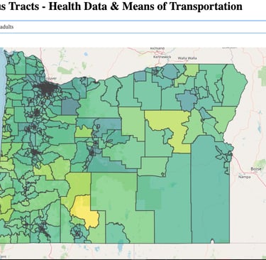
Exploring Health and Transportation in Oregon: A Data-Driven Dashboard
9/9/20244 min read
Exploring Health and Transportation in Oregon: A Data-Driven Dashboard
Click to see application (it may take a few seconds for the visual to load).
Introduction
In today’s data-driven world, interactive dashboards are powerful tools for understanding complex datasets. Our Oregon Census Tracts Dashboard combines public health data and transportation metrics to provide valuable insights into the relationship between health outcomes and commuting patterns in Oregon. This article explains the dashboard’s features, the data behind it, and the key lessons we can extract from it. By blending public health and transportation data, this dashboard allows us to explore important correlations and trends at the local level.
Overview of the Dashboard
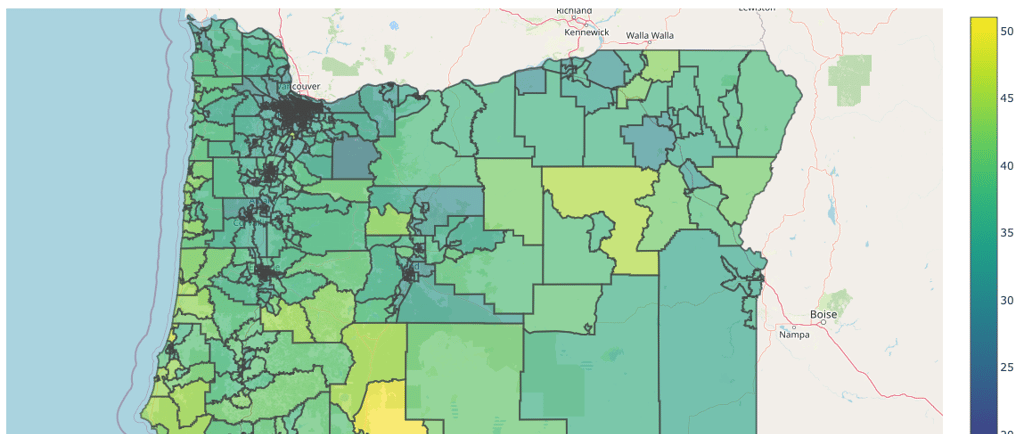
The dashboard enables users to visualize a variety of metrics related to health and transportation for Oregon’s census tracts. It includes data on household commuting methods, such as car commuting, public transit, biking, walking, and working from home. Additionally, it offers insights into public health statistics such as the prevalence of chronic diseases (e.g., diabetes, heart disease) and health behaviors (e.g., smoking, binge drinking).
The interactive nature of the dashboard allows users to explore how these variables vary geographically and potentially relate to one another. Users can hover over specific areas to view detailed information and adjust the data they want to analyze using a dropdown menu.
The Data: Where It Comes From
The dashboard integrates two key data sources:
1. PLACES: Local Data for Better Health - Provided by the Centers for Disease Control and Prevention (CDC), this dataset offers health-related data on a range of chronic diseases, health behaviors, and preventive services. The data is available at the census tract level, which provides a fine-grained view of public health at the local level.
2. National Transportation Atlas Database (NTAD) - This dataset from the U.S. Department of Transportation contains transportation data on how people commute to work. It includes information on different transportation modes like driving alone, carpooling, biking, walking, public transit, and telecommuting.
By merging these datasets, the dashboard creates a comprehensive view of how health and transportation intersect across different Oregon communities.
Key Features and Metrics
1. Health Metrics
The dashboard presents several health indicators derived from the CDC’s PLACES dataset. Some key metrics include:
• Diabetes: Percentage of adults diagnosed with diabetes.
• Obesity: Percentage of adults with obesity.
• Smoking: Percentage of adults who currently smoke.
• Asthma: Prevalence of asthma among adults.
• Mental Health: Percentage of adults reporting frequent mental distress.
These health statistics provide a detailed picture of the public health landscape, offering valuable information on chronic disease management, preventive health measures, and lifestyle factors that affect population health.
2. Transportation Metrics
The transportation data tracks how people get to work in each census tract. Key metrics include:
• Car Alone (%): Percentage of households where the primary mode of commuting is by car alone.
• Carpooling (%): Percentage of households that carpool to work.
• Public Transit (%): Percentage of households using public transit.
• Biking and Walking (%): Percentage of households that bike or walk to work.
• Working from Home (%): Percentage of households that telecommute.
These metrics allow us to explore commuting behaviors, which are increasingly relevant in the context of shifting work patterns due to the COVID-19 pandemic and growing concerns about environmental sustainability.
What Can We Learn from the Dashboard?
1. Health Disparities by Location
By visualizing health data across Oregon, the dashboard reveals significant disparities between different regions. For example, urban areas may have lower smoking rates but higher rates of asthma due to air pollution, whereas rural areas may face higher rates of chronic diseases like diabetes and heart disease.
2. The Impact of Transportation on Health
Transportation patterns can have direct and indirect effects on health. Long commutes, particularly by car, have been linked to negative health outcomes such as obesity, stress, and cardiovascular diseases. The dashboard enables us to explore whether regions with high car dependency also exhibit poorer health outcomes. Conversely, areas with high rates of walking and biking may correlate with better physical health, particularly lower rates of obesity.
3. Access to Public Transit and Health Equity
Public transit access is often associated with improved health outcomes because it provides people, particularly in low-income communities, with access to essential services like healthcare, groceries, and employment. By visualizing public transit usage alongside health data, we can identify areas where public transit expansion might improve health outcomes and reduce inequalities.
4. Telecommuting and Health
The dashboard also tracks work-from-home trends, which surged during the COVID-19 pandemic. This metric allows us to see where telecommuting has become more common and analyze its relationship with stress, mental health, and physical health indicators. In areas where telecommuting is higher, we might expect to see lower rates of stress-related illnesses due to reduced commuting time and more flexible work arrangements.
Academic Insights and Further Research
For researchers and policymakers, the dashboard provides a platform for data-driven decision-making. Understanding the relationship between transportation infrastructure, commuting patterns, and health outcomes can help guide public health interventions and urban planning strategies. By integrating health and transportation data, we can explore questions like:
• How does commuting time affect mental health?
• Can public transit expansion improve access to healthcare and reduce health disparities?
• What role does physical activity (e.g., biking and walking) play in mitigating chronic diseases like obesity and diabetes?
Future research could build on these insights by analyzing causality between these variables and exploring how other social determinants of health (e.g., income, education, housing) interact with transportation and health outcomes.
Conclusion
The Oregon Census Tracts Dashboard is a valuable tool for visualizing the intersection of health and transportation at the local level. By offering insights into how commuting patterns and public health vary across Oregon, this dashboard can help guide public health policy, urban planning, and future research. Whether you’re a policymaker, researcher, or member of the public, this dashboard empowers you to explore and understand the factors that shape the health of Oregon communities.
Understanding these patterns can lead to more equitable, efficient, and health-promoting environments, helping policymakers and communities to make data-informed decisions that improve both public health and quality of life.
This article showcases how the dashboard works and provides insight into the valuable information it can reveal. As new data becomes available and the dashboard evolves, we can continue to enhance our understanding of the relationship between health and transportation.