
Interactive Visualization: Exploring TriMet’s Transportation Network and Portland’s Road Conditions
8/23/20243 min read
Interactive Visualization: Exploring TriMet’s Transportation Network and Portland’s Road Conditions
Click to see application (it may take a few seconds to load).
Introduction
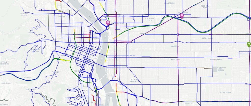
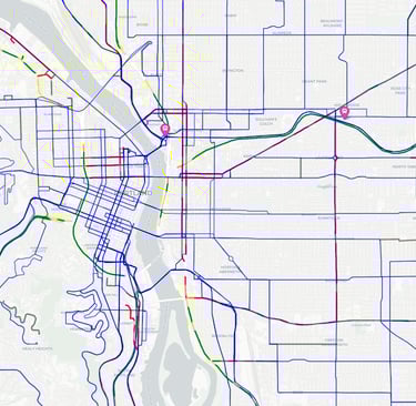
Public transportation and road infrastructure are critical components of urban planning and sustainability. Understanding how these systems function—where they excel and where they struggle—helps us improve the quality of life for city dwellers. To help the public and policymakers better understand Portland’s transportation landscape, we’ve created an interactive visualization that merges TriMet’s transit routes and stops with Portland’s road conditions data.
This tool allows you to explore the intricate network of TriMet routes, see where stops are located, and examine the condition of the roads these transit vehicles travel on. Whether you’re a commuter, an urban planner, or a curious data enthusiast, this visualization provides valuable insights into how well Portland’s transportation system is working.
What Does the Visualization Show?
Our interactive visualization combines several layers of information into one easy-to-use tool. Here’s what you can explore:
• TriMet Routes: View individual TriMet routes, including bus, MAX light rail, streetcar, and commuter rail lines. Each route can be toggled on or off, allowing you to focus on specific routes that interest you.
• TriMet Stops: Discover the location of all TriMet stops across the city, categorized by the type of service they provide (bus, light rail, streetcar, commuter rail, etc.). Each stop provides additional information, including stop ID, name, type of service, jurisdiction, and ZIP code.
• Portland’s Road Conditions: Analyze road quality across the city with color-coded layers representing the International Roughness Index (IRI) and Cracking Percent. Roads are categorized as being in good, fair, poor, or very poor condition, allowing you to see which areas may need improvement.
• TriMet Park & Ride and Transit Centers: View important transit hubs such as Park & Ride locations and major transit centers. These are marked with distinct icons for easy identification and include details such as address, city, and operational status.
How to Use the Visualization
Using this tool is simple, even if you’re new to data visualizations. Here’s how to get the most out of it:
1. Toggle Layers: You can toggle individual layers on or off using the layer control menu. For instance, you can choose to view all TriMet routes at once or isolate just one route to see its stops and path across the city.
2. Explore by Route: Want to explore the MAX Blue Line or a specific bus route? You can select a specific route from the layer control, making it easy to focus your analysis on just the areas that interest you.
3. Hover for More Information: Hover over any of the stops, routes, or road segments to reveal additional information. For example, you can see details like the route name and stop ID for TriMet stops, or the surface quality and roughness index for roads.
4. Analyze Road Quality: The road condition layer uses color coding—green for good roads, yellow for fair, orange for poor, and red for very poor—to give you a visual sense of which areas may need roadwork or improvements.
Why This Matters
Transportation networks like TriMet are the arteries of a city, and the quality of the roads they run on impacts everything from commute times to safety and accessibility. This visualization offers insights into how well Portland’s infrastructure supports public transit and the community.
• For Planners and Policymakers: This tool provides actionable insights that can help prioritize road improvements and transit expansions based on real-world data. By seeing which routes traverse the most deteriorated roads, planners can make more informed decisions about where to allocate resources.
• For Commuters: Understand how your daily routes are affected by road conditions and where improvements might be needed. With route and stop information, you can better plan your commutes and identify areas where service may be impacted.
• For Data Enthusiasts: Dive into the data behind Portland’s roads and transit system. This visualization offers a rich dataset that can be used for deeper analysis, whether you’re interested in public infrastructure, data science, or urban planning.
Conclusion
As Portland continues to grow and evolve, so too must its transportation network. Tools like this interactive visualization empower citizens, planners, and policymakers alike to make informed decisions that improve the city’s livability. We invite you to explore the tool, dive into the data, and join the conversation about how to make Portland’s roads and transit systems work better for everyone.
Tags: Public Transportation, Data Visualization, Portland, TriMet, Road Infrastructure, Urban Planning, Open Data, GIS, Interactive Maps