
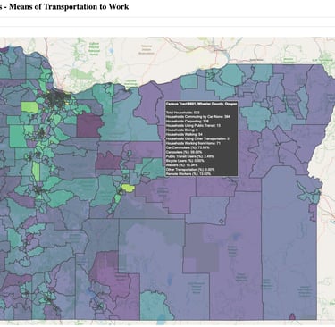
Visualizing Oregon Census Tracts: Means of Transportation to Work
Exploring Oregon’s Commuting Patterns with an Interactive Web Application Using U.S. Census Data
8/26/20242 min read
Visualizing Oregon Census Tracts: Means of Transportation to Work with Dash
Exploring Oregon’s Commuting Patterns with an Interactive Web Application Using U.S. Census Data
Introduction
Understanding how people commute to work is critical for shaping public policy, urban planning, and transportation infrastructure. This interactive visualization, hosted as a Dash app, showcases the means of transportation used by Oregon residents to commute to work, based on census tract-level data from the U.S. Census Bureau.
Overview of the Data
The data used for this application comes from the U.S. Census Bureau’s dataset on the means of transportation to work. This data provides detailed commuting statistics for each census tract in Oregon, including the number of households that commute by car, public transit, biking, walking, and more. The dataset can be found on data.gov, a platform that aggregates U.S. government data for public use.
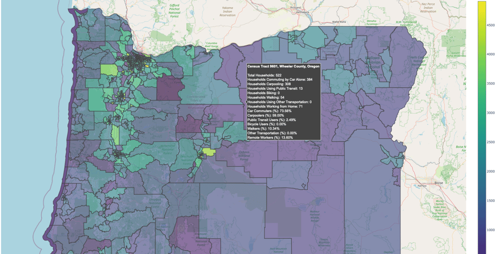
The Visualizations
The core visualization in this application is a choropleth map that highlights census tracts in Oregon based on different commuting metrics. Users can choose from several transportation modes such as commuting alone by car, carpooling, using public transit, biking, walking, or working from home. The interactive nature of this map allows users to hover over different census tracts to see detailed data, including the percentage of households using each transportation mode.
Deployment Process
The application is hosted on Heroku, a cloud platform that allows developers to easily deploy web applications. The deployment process includes:
1. Creating a Dash App: The visualization is built using Dash, a powerful Python framework for building analytical web applications.
2. Managing Dependencies: A requirements.txt file was created to specify the necessary Python packages such as dash, plotly, and geopandas. A runtime.txt file was included to specify the Python version.
3. Git and Heroku: After initializing a Git repository, the app was pushed to Heroku’s cloud platform. The process included setting up a Procfile to instruct Heroku on how to run the application.
4. Running the App: Once deployed, the app can be accessed via a Heroku-generated URL. This deployment allows the visualization to be publicly accessible without requiring any local resources.
How the App Works
Users are greeted with a dropdown menu that allows them to select a specific commuting metric, such as carpooling or biking. The map updates in real-time to reflect the selected transportation mode. Each tract’s hover information displays the exact number and percentage of households using each form of transportation.
Additionally, the interactive nature of the app allows users to zoom into different areas of Oregon to explore commuting trends in specific neighborhoods and regions.
Conclusion
This application provides a dynamic and insightful look into how Oregon residents commute to work. By leveraging Dash for interactive visualizations and deploying the app on Heroku, the project combines data accessibility with ease of use. It demonstrates the power of web-based data visualizations in uncovering patterns and trends that can help inform better decision-making in transportation planning and policy.